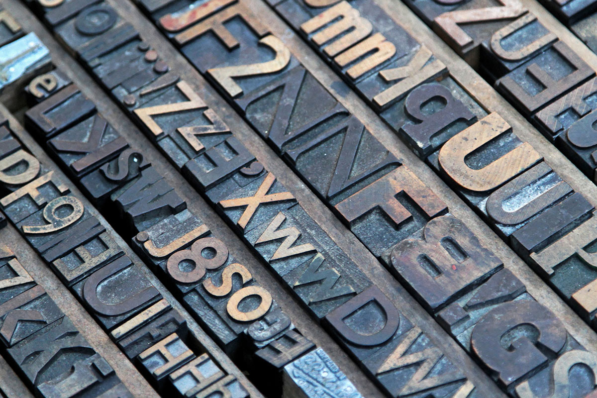
A picture’s worth a thousand words, but if you’re a savvy business owner, you probably know that the font you choose for those thousand words is pretty important too.
“It’s just like the filter that you put on a photo; it says a lot about the person and who they are. That’s what font faces represent,” says Kristyn Lechwar, Printing Solutions’ Director of Marketing. “It represents who you are and what your company is. Without someone actually being able to read the words, they can get a feel for your company just by looking at the font.”
We’ve put together our best tips for how to choose the best fonts for 2016. Is your favorite font sending the right image? Read on to find out.
Our Favorites
“Helvetica is the most famous font face around the entire world,” Kristyn says. It’s simple, easy to read, and not distracting.”
Other strong options include Akzidenz and Gotham, both of which are client favorites when it comes to san-serif font faces. For a more classic look, opt for Times New Roman, by far the most common serif font face.
You’ll also get more mileage out of a font family that includes bold and italic faces along with the regular font face.
“You can be versatile with them but they still maintain their same visuals,” Kristyn says.
Choosing a Font
If you’ve never worked closely with different font faces, you might not know which is really best for your company. You want to make sure you choose a font that fits the feel and attitude of your company while still making a statement. You can get a better idea of what font best fits your business by asking yourself some of the same questions that we ask our clients.
“When we’re making a new logo, it’s our job to feel out the client. What is their business? What is their mission? What is their culture like? What kind of clients are they working with?” Kristyn says. “If it’s a young, kind of hip company, then we can go with a young, hip font, but if a lot of their clientele is 50 and older, we need to make sure that it’s appropriate to the demographic of people that they’re working with.”
For example, Kristyn says, a law firm would not want to go with Curlz MT as their font face, but a Dr. Seuss-themed pediatric dentist might want something a bit more in keeping with the whimsical feel of the books it is based on.
“Every company is different. That means that every font chosen is going to be different,” Kristyn says.
Color Matters
Our favorite fonts are nothing without color, which says just as much about your business as your font does.
“Colors have all their theories about what they mean, and people take those seriously,” Kristyn says. “We all have this same kind of idea that pink is feminine and blue is masculine, and red means angry, and black means angry, and yellow means happy and sunshine. It says something about your company.”
If you’re running a law firm, for example, pink probably isn’t going to be your first choice of brand colors. You’re much more likely to opt for red, black, or yellow, which are typically seen as more strong and authoritative.
It’s also important that you use your colors consistently with your font choice to prevent brand confusion. Kristyn uses Google as an example.
“Their company is recognized not just because of their name, but you think of Google you think of the red, the blue, the green,” she says. “That’s just colors. It’s nothing really to do with the font but they have to go hand in hand.”
For more tips on choose a font and color, or to learn more about our design and print services, give Printing Solutions a call at 480-596-6300.

 BONUS: